
Research • Data Visualization • Public Health
FORTRESS Dashboard
An interactive dashboard for Overdose Fatality Review (OFR) teams to analyze population-level county data to identify community trends, explore overdose touchpoints, and generate data-driven recommendations for overdose prevention.
BACKGROUND
OFR teams are multi-disciplinary teams from varying disciplines such as coroner, law enforcement officers, medical health specialists, among others.
OFR teams review 2-3 overdose decedent cases monthly, identifying gaps in existing structure and recommending strategies to prevent future overdoses.
The factors affecting overdose rates are shown to vary considerably across geographic locations.
THE PROBLEM
The limited cases OFRs discuss may not always be an ideal indicator of the entire community’s needs because of variations across locations.
OFR teams have varying levels of data literacy, and despite their domain experience and community knowledge, they lack the structured integration of population-level data.
Research Objectives
Understand User Needs
Identify OFR users' expectations and needs from a data dashboard.
Consider Hopes and Fears
Identify OFR users' hopes and fears from a population-level data tool.
Develop a Dashboard
Design and develop a dashboard for users who are not experts in population-level data analysis.
User-Centered Design Process
To collect the OFR requirements, a user-centered design methodology was adopted, placing the needs of the users at the center of the design process.

Pain Points & Challenges
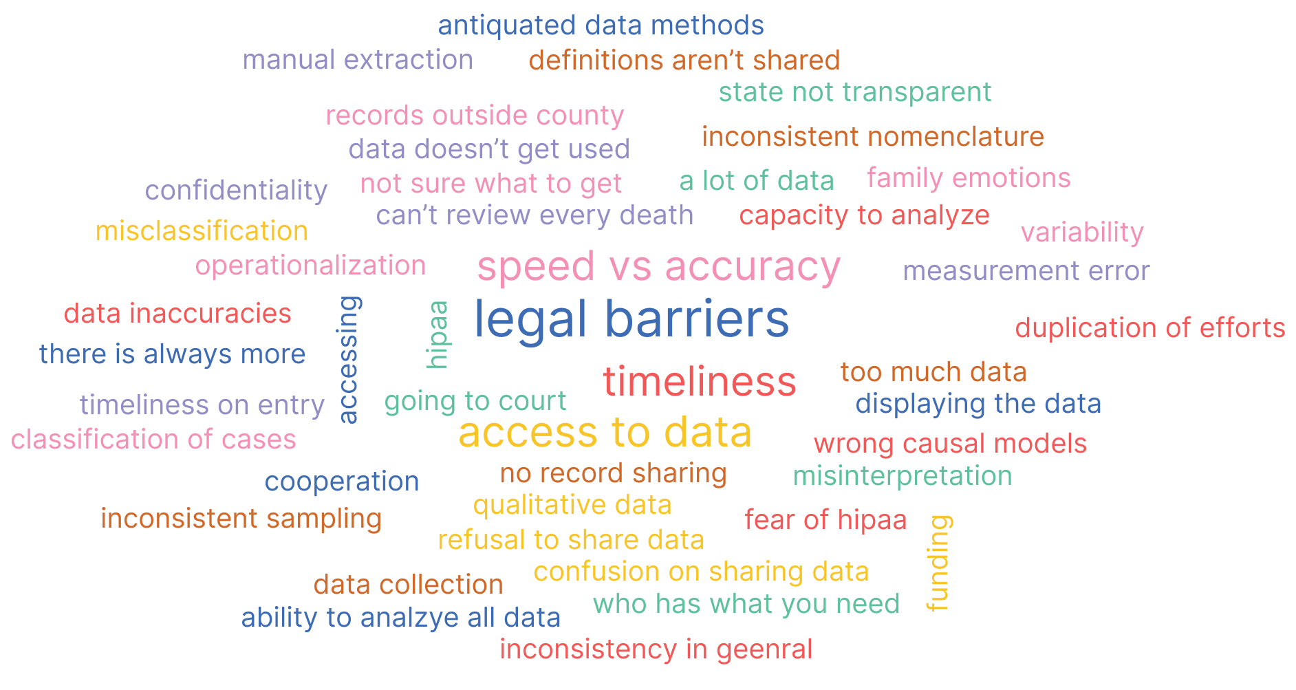
The recruited experts were prompted to share challenges and pain points via Menti. This was then used to create a word cloud.
Goals & Features
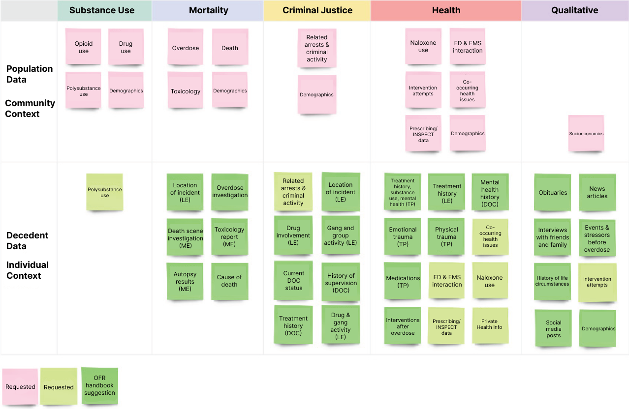
The experts were divided into 2 groups for a more in-depth discussion on the teams' high-level design parameters, key data attributes they needed in the dashboard, and any hopes and concerns they had with the dashboard’s integration into the OFR review process.
A white board with post it notes was created with topics to talk about and discuss to identify the attributes. These topics were selected from the team’s previous work with OFRs and the OFR team handbook, essentially a guide for OFR members.
Data Attributes & Metrics
Based on the focus groups discussions, 3 primary challenges that OFRs faced were identified: data accessibility barriers, data literacy concerns, and privacy concerns. Key attributes which were repeated often were also identified.
Touchpoints
These are events that individuals interact with prior to their fatal overdose like release dates from prison, and last known date for ED visits or EMS interactions.
Social Determinants of Health
Non-medical conditions in the individual's environemnt such as access to harm reduction services, housing, and naloxone.
Case-specific Data
Data related to decedent cases including details from next of kin interviews and circumstances at the time of death such as whether they were alone, or what position the body was found in.
"Average days out from treatment and incarceration because I feel like those are solid spaces that action can be taken." — OFR Participant
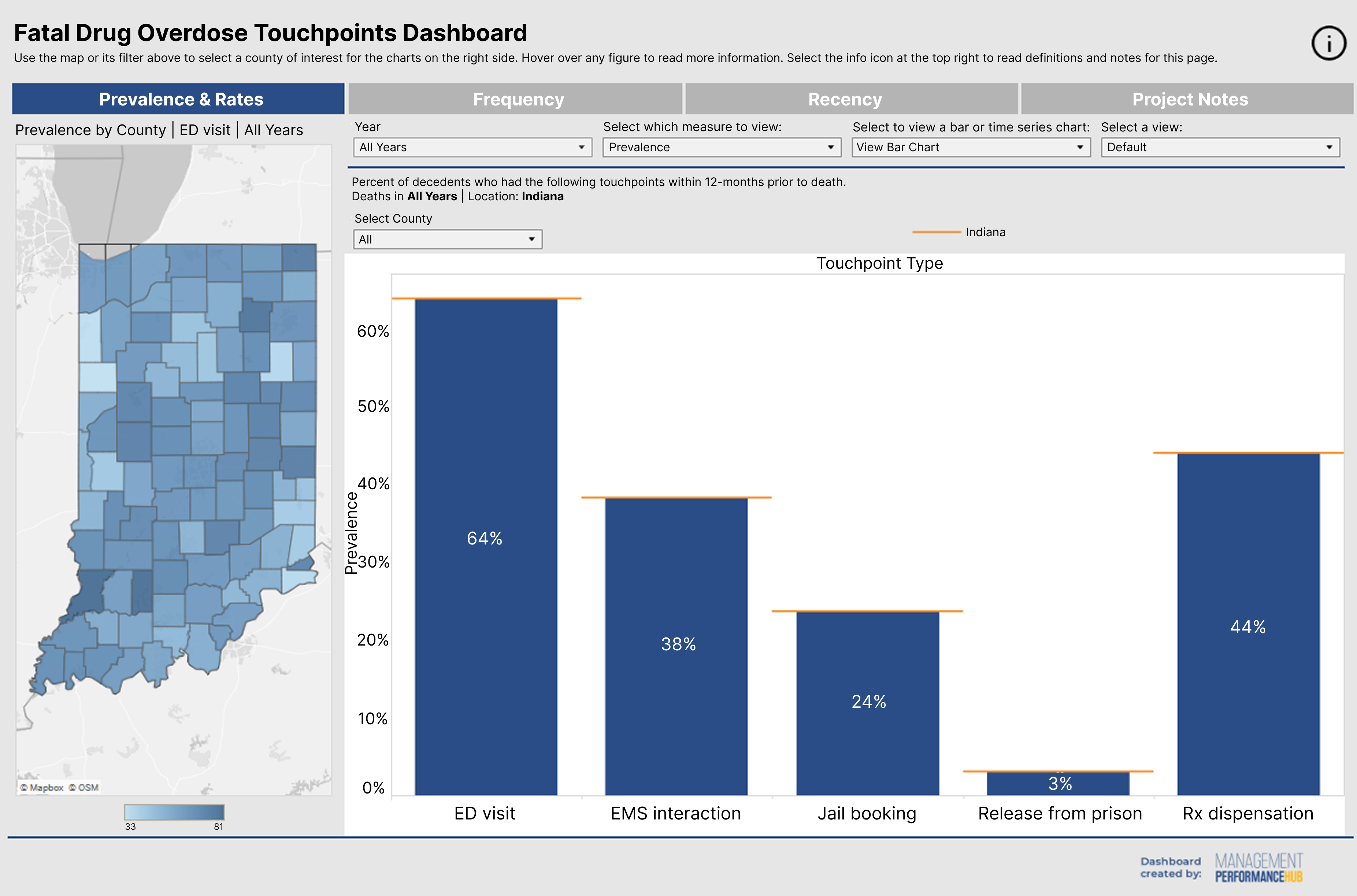
5 touchpoints were selected: ED visit, EMS interaction, release from prison, jail bookings, and Rx dispensation. Social determinants of health and case-specific data were not selected based on data availability and to push aggregate level thinking for OFR teams.
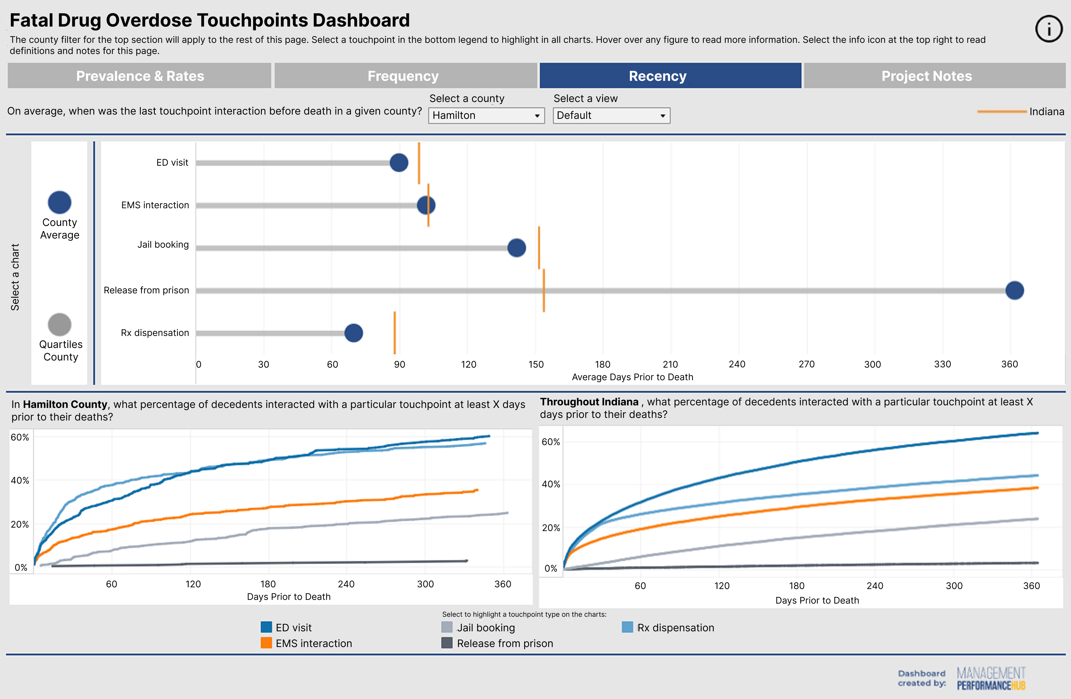
Specific metrics to display the touchpoints were identified namely: prevalence, rate per 100k, frequency, and recency. These metrics were selected based on previous research and the design thinking methods of OFRs.
Initial Designs
What did I Focus On?
I encountered challenges in designing for OFR users, including introducing unfamiliar visual analytical tools and augmenting OFR's existing qualitative sensemaking model with quantitative, aggregate data. These are often overlooked by visualization design methodologies, but addressing them are crucial for identifying data-informed solutions.
Lack of Analytical Tasks
As OFRs are structured around qualitative case reviews, even after multiple rounds of user-centered design focus groups, characterizing a set of analytical questions the users aim to perform—one of the first steps in visualization process—was difficult.
Simple Charts
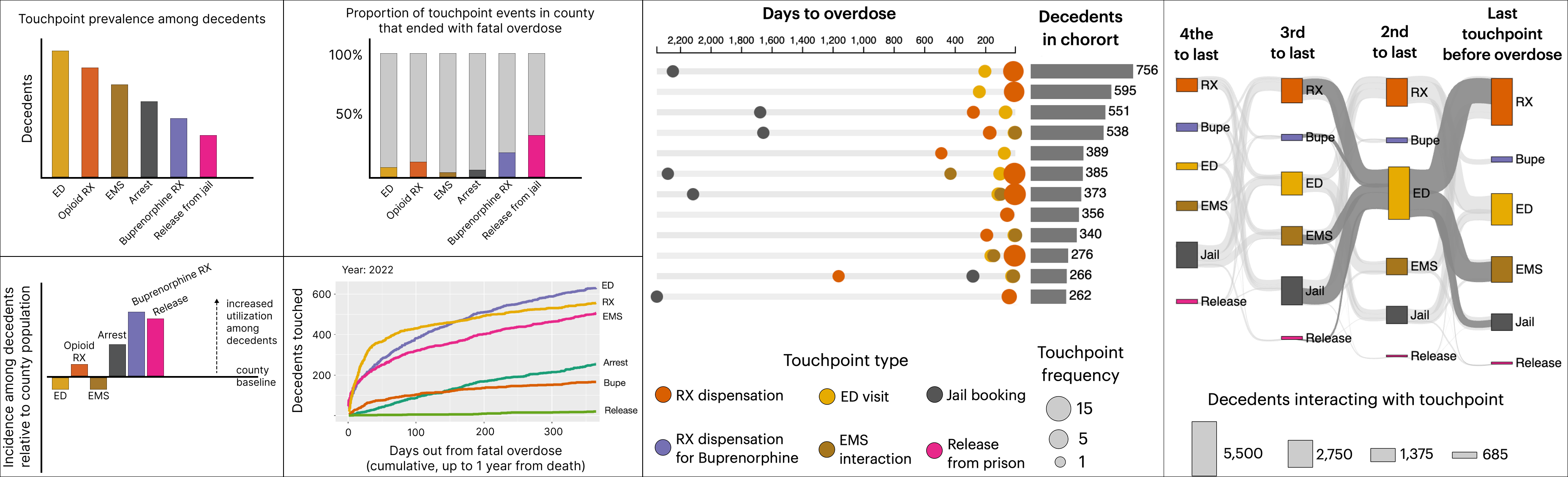
To make analysis easier for OFR users, I designed familiar and easy-to-read charts, such as bar and line charts, to compare metrics and show trends over time. I also used choropleths to show geographic utilization of touchpoints across counties.
Mental Models
I also utilized unusual charts, such as lollipop and sankey charts, to visualize recency of touchpoints. Similar to decedent timelines frequently developed by OFR teams, the aim was to evoke familiar mental models and co-opt them for interpreting new and unfamiliar data.
TESTING OBJECTIVES
I conducted a second focus group with the same OFR experts, with the objective of getting feedback on the designed charts.
I wanted feedback on individual charts and features as well as comparisons with similar dashboards, to identify what improvement could be made.
USABILITY RESULTS
Simple bar charts were seen as easy-to-understand, but other bar charts, such as diverging and proportional were found to be time-consuming.
Line charts were easy to read, but OFR experts preferred other charts from other dashboards because they found them to be visually better.
Experts found lollipop and sankey chart too overwhelming, even though they liked it and found them appealing and interesting.
Iterations & Refinement
To address the drawbacks from OFR users' feedback, I made several refinements to the charts. These included adding features to the charts, as well as modifying the existing designs.
Annotations Added
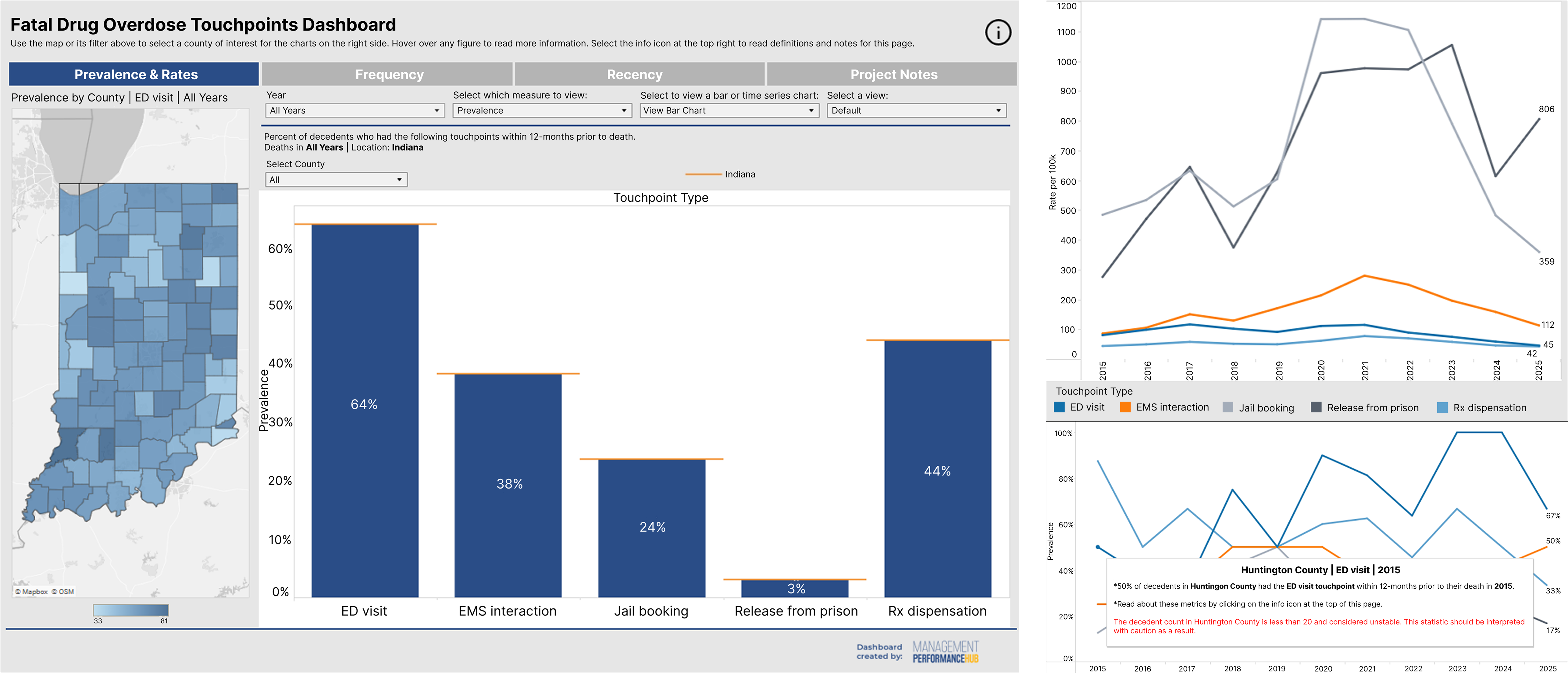
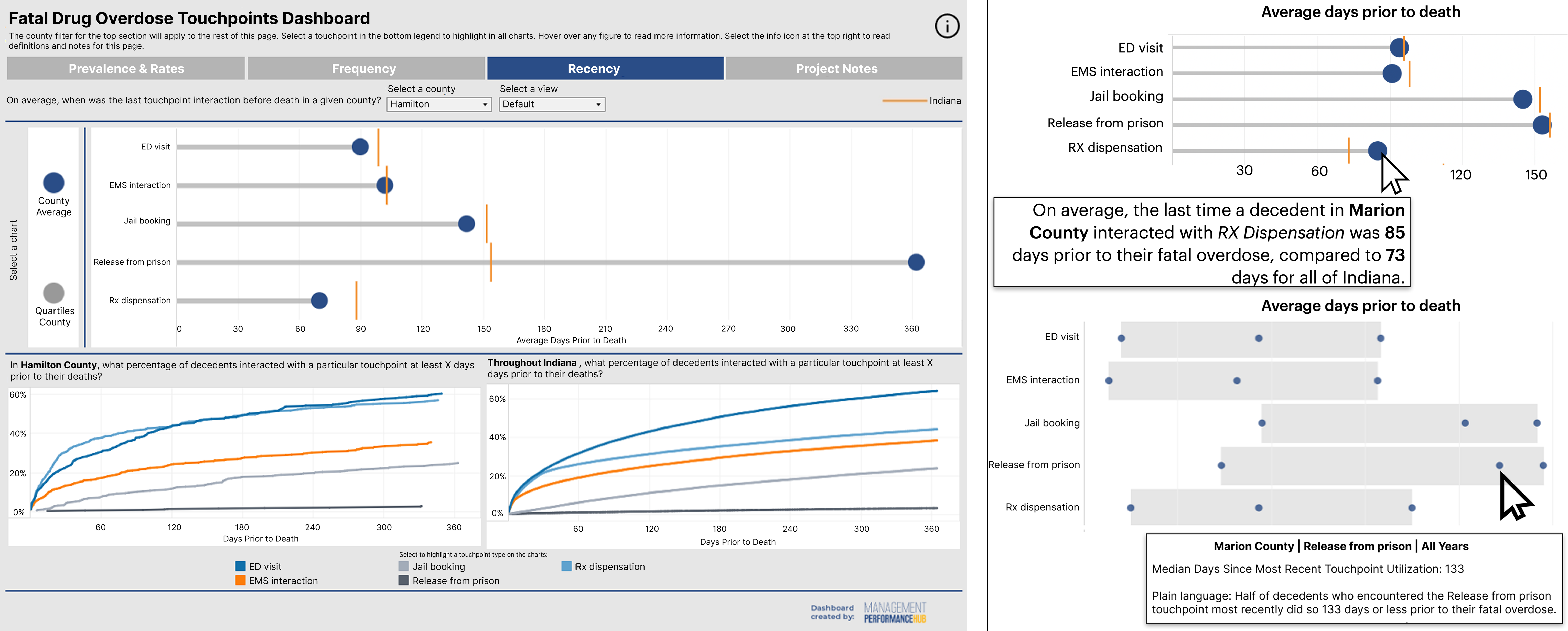
To overcome concerns about data literacy, tooltips in thh form of brief annotations were added to guide and help users understand each visualization.
Privacy Ensured
The numbers were continued to be shown in the form of percentages and rates. For counties with low number of decedents, warnings were added for users, cautioning them against drawing strong conclusions from small samples.
Chart Modifications
The sankey chart was removed, while the lollipop and line charts' designs were replaced with simpler versions.
"It is interesting to see this chart, and to know what can be done with data. We can check the timeline and help implement a strategy. Through these strategies, we can outline short, medium, and long-term goals." — OFR Participant
Final Dashboard
The final dashboard integrates statewide overdose touchpoints in the form of bar charts and line charts, county-level map for the state of Indiana, and features to support collaborative decision making.
Takeaways
Prioritize Simplicity
Keeping charts simple is essential when designing for users with limited data literacy, helping them interpret information quickly and confidently.
Leverage Familiarity
Using familiar visual patterns helps new users feel comfortable with the interface and encourages continued use.
Design for Inclusion
Supporting data interpretation, such as through annotations, and using percentages to address privacy concerns helped impove accessibility and address privacy concerns.